
 by Steven D. Johnson
Racine, Wisconsin
(Page 2 of 4)
Previous Page
1
2
3
4
Next Page
A Tale Of Two Benches – My Design Process
Click on any picture to see a larger version.
Two benches, about as different as night and day, are what I am trying to design right now. The first, a bench for just inside our entryway, will be a place to store and change shoes and perhaps hold a bag or two of groceries as we try to get inside the door… comfort is unimportant for a short sit and shoe change. Blending the aesthetic and functional is always important, but this design will be heavily skewed toward the aesthetic. The second design, a comfortable bench to reside in front of my shop, will be a place for guests to sit, chat, and watch the world go by as they settle into the slow rhythm of my woodworking lifestyle. Without the necessity to conform to a particular style this bench is more about creative design freedom and showing off a bit of craftsmanship to visitors.
The "inside" bench has a couple of size constraints, making overall "scale" critical. This bench needs to be "wear and tear" sturdy, but also airy and whimsical to fit the room's décor. Wood choice is unlimited.
The "outside" bench has no size or style constraints, but begs a degree of complexity befitting a woodworker's shop. No whimsy… instead, serious with flowing lines, harmonious woods, and balance. I'm leaning towards a Lutyens-inspired design. Of course, wood choice and finish will be guided by Mother Nature's vagaries.
For some pragmatic and domestic tranquility reasons, I began working first on the design of the "inside" bench. Drawing, as regular readers are acutely aware, is not my forte. Imagine a thumbless right-handed inebriated vertebrate holding a pencil in his left hand and drawing while floating in the zero gravity of the space station and you will get a pretty good idea of my sketching capabilities… sketchy, at best. Yet I continue to try, because I know that "good" woodworkers should work from a design.
The first thing everyone notices about a bench is the back. They put advertisements on the back of bus stop benches for a reason. And if a bench is to be designed with a traditional rail and stile backrest, the top rail will be the first thing that draws the eye. So I started there.
|
|
Figure 4
|
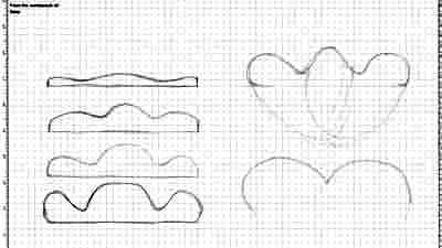
As I sketched different rail design ideas, it was apparent that thinner, less curvy top rails looked more refined and traditional, and as I drew bolder, more curvaceous rails, the look became increasingly more whimsical. By the time I had drawn the fourth version of a rail, it was bulbous, almost comical… but I liked it (see the left hand side of Figure 4). This look will fit well with the Burton Morris under which the bench will reside.
|
|
Figure 5-I doodle poorly, too
|
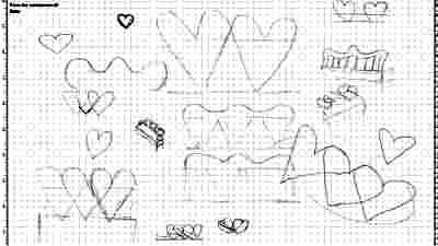
As I looked at the exaggerated curves of the top rail, I was reminded, for some reason, of a Valentines' heart… actually two Valentine's hearts. In the top sketch on the right hand side of Figure 4, I began to lightly pencil in the shape of the overlapping hearts, and for some reason, I kept coming back to that idea. I tried to get away from it (bottom right-hand side sketch) but the two hearts had already captured mine.
My first thought was that a rounded top rail and the arrangement of supporting stiles could evoke the visualization of the two intertwined hearts, and angling the stiles almost got there, but it just wasn't quite as whimsical as I hoped… it was still a bit too traditional for our house. I doodled a dozen drawings, but none were quite "it." Plus, I was having a heck of a time drawing anything close to a symmetrical heart, let alone a pair of them.
|
|
Figure 6 - The idea is starting to take shape
|
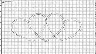
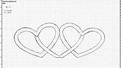
For a break and a little inspiration I searched the internet for "Valentine's Hearts." There were literally thousands of images, but in short order I found one that looked to be just the right shape and scale… a plump little heart. I printed out two copies, cut them out with a pair of scissors, and experimented by placing them side-by-side in different positions. When I got a pleasing arrangement, I traced around the two hearts. It was then I realized that a curvy top rail was not going to achieve the look I wanted. Instead, a back made up of all curved rails would evoke the light, airy, whimsical look I was seeking. But the rails looked too thin… good for bending, bad for strength (see Figure 6). I added another set of curved rails, essentially evoking a third heart between the first two, and the design started to take shape… and it looked like it might support the occasional "lean back."
|
Figure 7 - With the backrest designed,
all I have to do is figure out how to build it!
|
So in my next drawing I thickened the rails (to about 2-1/4") and made sure everything was drawn to scale (1/4" = 1"). Figure 7 is the final design for the backrest of the bench I will be building. I have since decided to also use a corresponding portion of one of the heart curves as arm rests for the bench. The design, I think, is pleasing, fits the décor, and seems to have passed muster with the boss. Now I all I have to do is figure out how to build the thing!
(Page 2 of 4)
Previous Page
1
2
3
4
Next Page
Return to Wood News front page
